https://x.com/takupPhoto/status/2089909246196601039?s=20
https://x.com/naraemigenshin/status/2090097926282592330?s=20
https://x.com/naraemigenshin/status/2090047751782646004?s=20
어제 오늘 탐라에 떠서 나도 해봤는데 예쁘더라.
스크린샷 말고 풍경화 사진으로도 많이 하는데 그것도 예뻐!
프롬프트는 밑에~
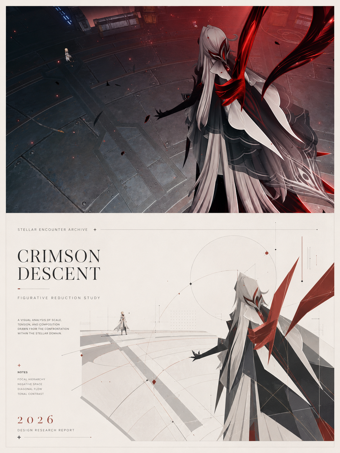
이건 내가 해본 건데, 원본을 같이 붙여주넹.
프롬프트 원문이고,
请将我上传的每一张照片分别作成一张独立的高级极简设沟报,不多图拼,每张照片都要单独输出。 整体采用34竖版构图,上下两个区城高度严格11,各占画面50% 上半部分保酒原险照片,保持主体结构、真实质感,自然光影和原有色彩氛城,仅进行经微真级摄影调色,使其具有志摄影和艺术晨展览奶感。为适配画幅,可以白然扩展天室,地面或环境背景,但不得拉伸、抓曲或改变主体, 下半部分提取照片中主体最具识别性的轮麻与结构,使用简洁几何形状、扇平色坎、细线策和留白进行板简油象化表达。不要写实插画,不贾复杂节,但要保主体特征,让人能够一眼识别原物。配色从上方片中提取,可加入少最水平线、纵构线或抽象环滚元素。 整体使用米白色或浅色背景,人面积留白,主依居中,构图平衡克制。可加入少量简洁英文标题、综号成年份、风格农考国际设计工作空,建筑海报、艺术展赏海报和高级品济视觉系统,高级、见代、安阶、艺术化,踢免养通池镜、廉价欠量感、卡通、电前感和模板感、
걍 구글번역기로 영문으로 바꾼거
Please create a separate, high-quality minimalist design report for each of my uploaded photos. Do not combine multiple images; each photo must be exported individually.
The overall composition should be a 3x4 vertical layout, with the top and bottom sections each occupying 50% of the frame. The top section should retain the original photo, preserving the subject's structure, realistic texture, natural lighting, and original color atmosphere. Only minor photorealistic color correction should be applied to give it a professional, art exhibition feel. To fit the frame, you can naturally expand the ceiling, ground, or background, but do not stretch, distort, or alter the subject. The bottom section should extract the most recognizable outlines and structures of the subject from the photo, using simple geometric shapes, flat color schemes, fine lines, and white space for a simplified, figurative expression. Avoid realistic illustrations and complex details, but retain the subject's characteristics so that the viewer can immediately recognize it. The color scheme should be extracted from the top section, and you may add a few horizontal lines, vertical lines, or abstract circular elements.
The overall design uses a beige or light-colored background, with ample white space around the subject, a centered main element, and a balanced and restrained composition. A few simple English titles, year numbers, and stylistic elements can be added, reflecting the style of international design studios, architectural posters, art exhibition posters, and high-end visual systems. The overall aesthetic should be sophisticated, contemporary, elegant, and artistic, avoiding elements like cheap, low-quality materials, cartoonish themes, or a template-like feel.